Friday, 14 January 2011

First attempt at stained glass!


James Lethbridge

Stained glass was the first new technique that we learned in second year, and it coincided with our Inspiration brief. I had done initial research on a few artists for inspiration and James Lethbridge was one of them.

For my stained glass 'cartoon' (accurate template for the glass to be cut to), I simply photocopied a page of my sketchpad on which I had drawn one of James Lethbridge's pieces, and using the lines within the drawing, separated it into sections which would then be the pieces of glass.


I worked on the glass in a variety of different techniques; the first being screen-printing (black), which directly transfers an image onto glass. I chose sections of the drawing that would be screen printed, as I wanted build the image up in layers, and I decided to leave the text on, as it would then be a working drawing, and I thought it would add to the sketchiness.

The second layer was silver-stain (yellow/brown), which I think adds a depth to the glass:


Close-ups:


Leading Up...


The finished piece:


I'm really happy with how this panel has turned out, particularly the bottom half simply because of the colour and the depth that has been created with the layering effects.


A Second Stained Glass Window!


As I liked the bottom half of my first stained glass panel so much, I decided to blow up the same drawing I had used initially and do another panel just of this section on a larger scale.

I used the same processes; screen-printing, silver-stain, sandblasting and engraving:


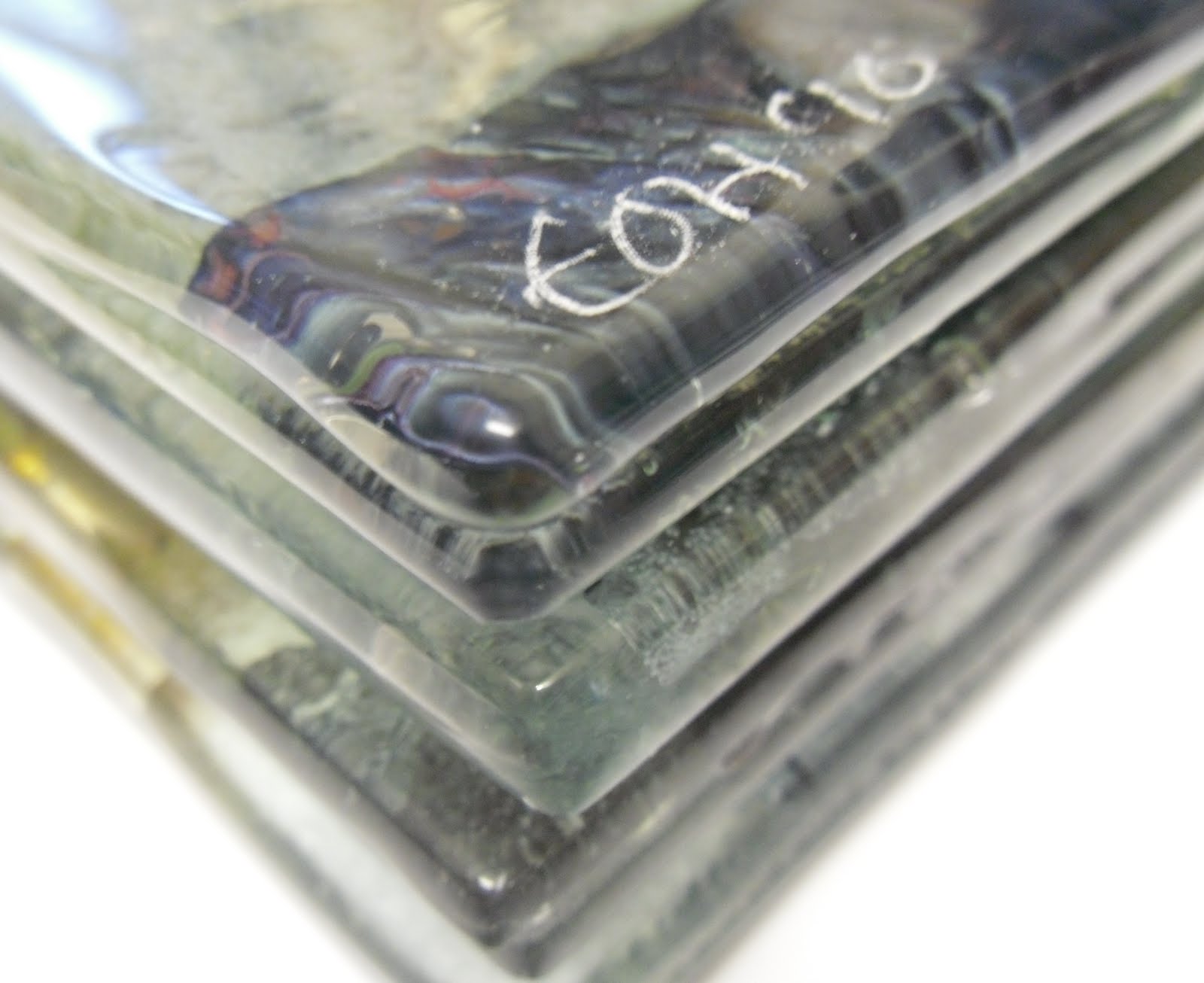
These photos below were taken on a wooden table rather then the white background on the photos above because it shows up the sandblasting and engraving where the previous photos don't.


The finished piece:


I much prefer this one to my first attempt, I think the first one had a bit too much clear glass on it whereas this one has much more going on and is vibrant and exciting.

Tuesday, 21 December 2010

Inspiration Continued..

David Flower

I had chosen to look at David Flower as my main inspirational artist for this brief after seeing these blown pieces he had done (example above). It was the contrast between the controlled, structured shape of the pieces and the busy, spontaneity of the interiors that drew me in to his work. It wasn't until closer inspection that I realised there was metal inclusions in Flower's work, and from what I could see this is what had caused the bubbles after he had blown through a material or mesh of some kind.

Luckily, I had been offered a placement at the World of Glass in St. Helens, where I could go every wednesday and help the glassblowers while in return I could be trained and use the facilities for my own work. This was perfect timing for this brief, where I could use the hot glassblowing facilities to try to create a piece inspired by David Flower's blown forms.

Talking to the glassblowers at the World of Glass, they advised me on the best methods on how to carry out a piece using wire inclusions, and we came up with the idea to create a copper cage which could be attached to a small gather of glass, have more glass gathered over the top and be blown through to create the different sized bubbles seen in David Flower's pieces.

Below you can see the first copper cage I made, and I had tried to make them relatively loose and random, so that once it was blown through, the effect would be entirely spontaneous.


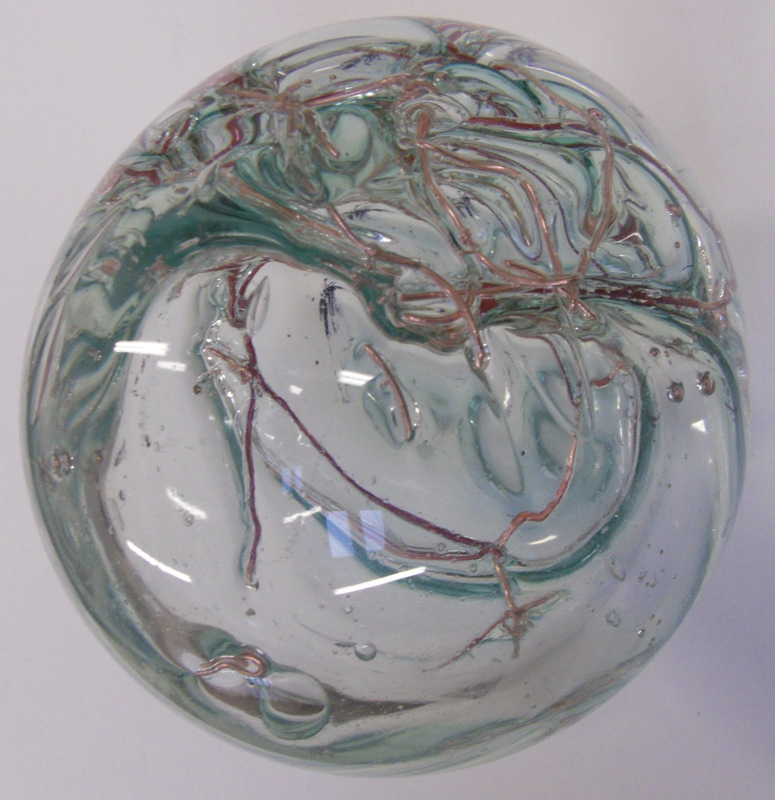
This was the result of the first blown form. As you can see it has not come out much like David Flower's piece at all, as the copper had got so hot and soft in the glass that when it was blown into it just stretched with the glass instead of the air going through the gaps in the cage. Despite this though, I really like the effect, and I also love that the copper has turned a purpley red colour.


Close-ups:


With the second attempt, the glassblowers at the World of Glass suggested I colour the glass, and I wsn't a hundred percent sure that I wanted to do this because I like the simplicity of the clear glass and I didn't want any strong colour to take away from the copper inside. Therefore I chose to colour the glass very very slightly, and with a neutral colour, which has worked out well because it just looks like a different type of glass.

Also, what I find interesting is that the copper in this piece has not all turned a reddy colour, some is still the same copper colour which I think works well.


Close-ups:


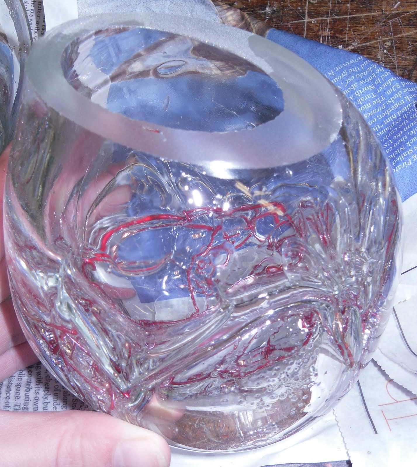
The one thing I wasn't too keen on was the actual shape of the pieces, I thought they looked a bit too much like lightbulbs for my liking! So I (well..Brian!) cut the tops off at an angle, which made a huge improvement in my opinion.


Now all I had to do was decide how to display the forms, and what I was actually going to do with them! I toyed with the idea of putting them with a fused glass panel which also had copper inclusions in it, and I did do a few test pieces for this but it wasn't something I was excited about, and my gut instinct was that these pieces should be left as independent forms, and the idea of having a flat panel would be taking away from the shape and form itself.

So then I thought of somehow incorporating the copper cages I had made and used for the inclusions but using and attaching them to the tops of the pieces. So I decided to make copper rims for the tops of the glass which the copper wire could almost be sewn through tiny holes.


These rings took me so so long to do as I had to use a piercing saw which are absolutely TINY!! Literally the saw didn't even look like it was moving!! But I got there in the end and it was well worth the pain and effort-


I had measured the rings to be a few millimeters bigger than the size of the glass, to allow for the copper wire to be fed through and back up again into the cage.

SO happy with the results!!


Wednesday, 1 December 2010

Glassline Chalks

Here are a few experiments I did with my new glassline chalks- chalks specifically designed for drawing on glass. I was really excited about these, because I love creating textures on the surface of glass, and these chalks seemed like they would create the perfect effect for my work. They have to be used on sandblasted glass so that the chalk has something to grip.

I had a white chalk and a grey chalk, as well as black and white glassline pens (literally a pen for glass!). The brief we were doing at the time was 'Inspiration', and so I chose to draw some pieces of work I was looking at for the brief, and therefore work that inspired me.

I have included a photo of the piece before it was fired, as well as the images I was inspired by and used for a basis:
1


Bocci

2

David Flower

Experimenting with Silver Stain


Here are a few test pieces I did at the start of this year, experimenting with silver stain which stains the glass yellow-brown; the darkness depending on the temperature of the firing and the consistency of the mixture. I don't particularly like the effect when it turns the glass yellow, but I love this particular amber result:


After they had been fired, I then sandblasted some areas to remove the silver stain to finer lines than I could have painted it on to. I sandblasted both sides of the glass and I actually really love the results. Even though these were only experiments, I could imagine using these techniques to produce a layered finished piece.


Monday, 8 November 2010

More, better, coasters!


Here are a few photos of some more recent coasters I have made as gifts and to sell. I have used inclusions in these coasters, which I have never used before in coaster form, however I loved the effects it created from the experiments I did last year so I thought I would try it, and they've worked out really well!


This particular coaster (above) has copper leaf, silver leaf, gold leaf, brass sheet, copper tape, and even part of a Ferrero Rocher wrapper trapped inside two pieces of glass.

I love the unpredictability of the materials, as different things happen to them depending whether they're overlapped, and what in particular they're overlapped with.

Because of this, it can be hard to identify which material is which after it has been fired, because they change in appearance so dramatically!


Also, I have bought an engraver for me to sign my work, woo!

End of First Year


As I have now started my second year, I thought I should finish off the blogs from last year and show what I did for my final piece. My last brief was based on Protrait and Identity, and I was primarily looking at the idea of subtlety in faces, and not necessarily at first glance identifying a face in an image. Because of this, I was looking at the work of Francis Bacon, and taking the abstraction of faces from his work.

To begin with I drew some of his paintings in my own style of drawing, and from these I decided to try and incorporate the spontaneous mark-making I had created.

To do this I decided to create layered pieces which included a multiple of techniques such as sandblasting, engraving and UV Bonding, as well as screen printing (look at previous blog!).

These are the results-


This is how I arranged my pieces to be exhibited.

I had also done 3 layered pieces with White Opal Flash Glass (clear glass with a thin layer of white glass on the surface which can be sandblasted through to create interesting effects). These were done solely with sandblasing and engraving, and I really liked these until I added the coloured glass panels at the back.

I did this because these were some of the colours Bacon had used in his paintings. However now I think it takes away from the simplicity of the clear and flash glass.