David Flower
I had chosen to look at David Flower as my main inspirational artist for this brief after seeing these blown pieces he had done (example above). It was the contrast between the controlled, structured shape of the pieces and the busy, spontaneity of the interiors that drew me in to his work. It wasn't until closer inspection that I realised there was metal inclusions in Flower's work, and from what I could see this is what had caused the bubbles after he had blown through a material or mesh of some kind.
Luckily, I had been offered a placement at the World of Glass in St. Helens, where I could go every wednesday and help the glassblowers while in return I could be trained and use the facilities for my own work. This was perfect timing for this brief, where I could use the hot glassblowing facilities to try to create a piece inspired by David Flower's blown forms.
Talking to the glassblowers at the World of Glass, they advised me on the best methods on how to carry out a piece using wire inclusions, and we came up with the idea to create a copper cage which could be attached to a small gather of glass, have more glass gathered over the top and be blown through to create the different sized bubbles seen in David Flower's pieces.
Below you can see the first copper cage I made, and I had tried to make them relatively loose and random, so that once it was blown through, the effect would be entirely spontaneous.

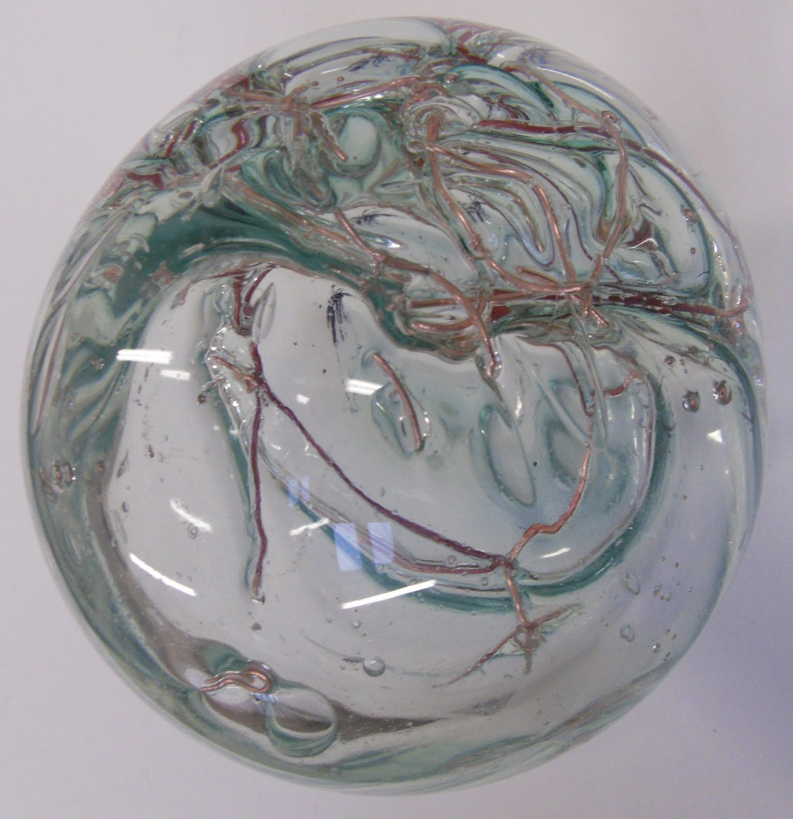
This was the result of the first blown form. As you can see it has not come out much like David Flower's piece at all, as the copper had got so hot and soft in the glass that when it was blown into it just stretched with the glass instead of the air going through the gaps in the cage. Despite this though, I really like the effect, and I also love that the copper has turned a purpley red colour.


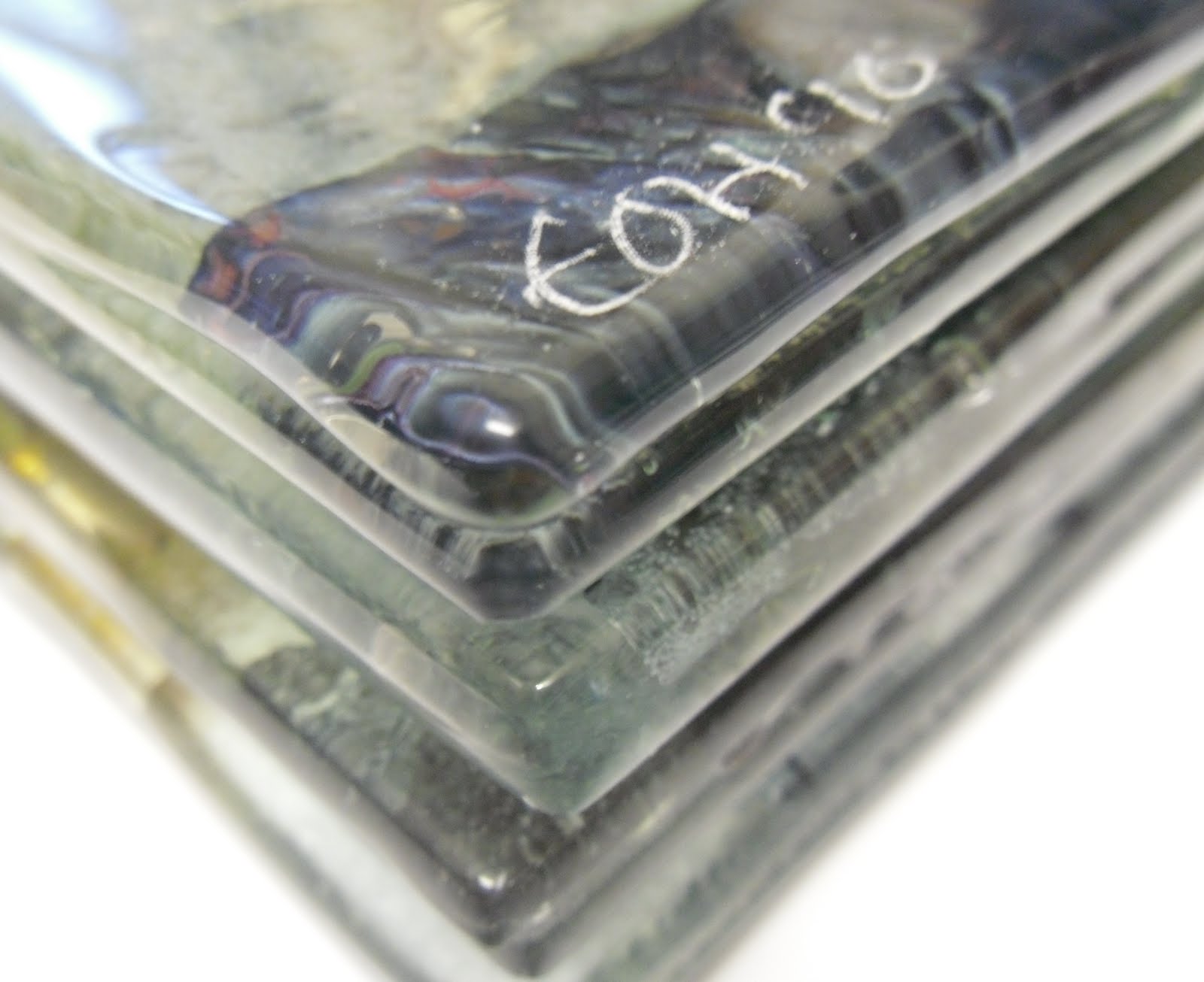
Close-ups:


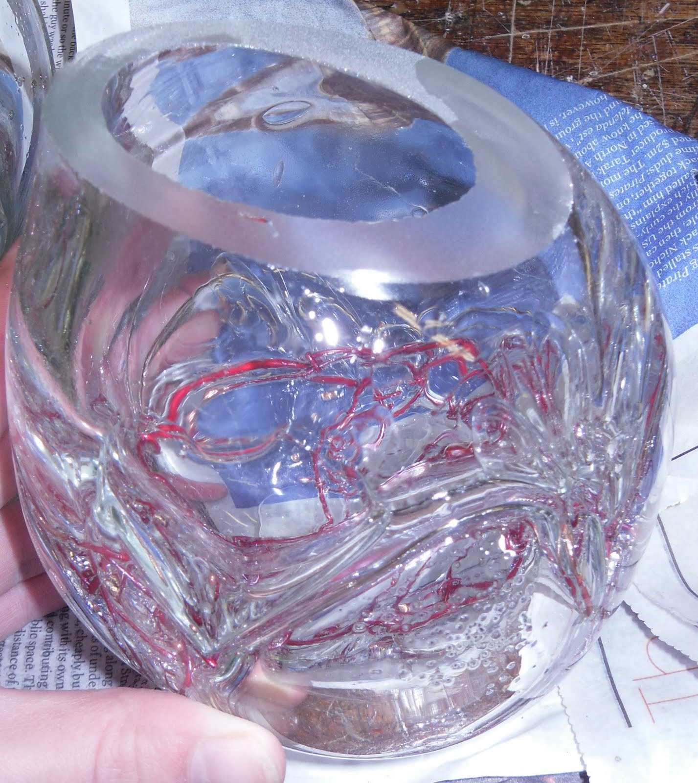
With the second attempt, the glassblowers at the World of Glass suggested I colour the glass, and I wsn't a hundred percent sure that I wanted to do this because I like the simplicity of the clear glass and I didn't want any strong colour to take away from the copper inside. Therefore I chose to colour the glass very very slightly, and with a neutral colour, which has worked out well because it just looks like a different type of glass.
Also, what I find interesting is that the copper in this piece has not all turned a reddy colour, some is still the same copper colour which I think works well.
Close-ups:


The one thing I wasn't too keen on was the actual shape of the pieces, I thought they looked a bit too much like lightbulbs for my liking! So I (well..Brian!) cut the tops off at an angle, which made a huge improvement in my opinion.

Now all I had to do was decide how to display the forms, and what I was actually going to do with them! I toyed with the idea of putting them with a fused glass panel which also had copper inclusions in it, and I did do a few test pieces for this but it wasn't something I was excited about, and my gut instinct was that these pieces should be left as independent forms, and the idea of having a flat panel would be taking away from the shape and form itself.
So then I thought of somehow incorporating the copper cages I had made and used for the inclusions but using and attaching them to the tops of the pieces. So I decided to make copper rims for the tops of the glass which the copper wire could almost be sewn through tiny holes.
These rings took me so so long to do as I had to use a piercing saw which are absolutely TINY!! Literally the saw didn't even look like it was moving!! But I got there in the end and it was well worth the pain and effort-

I had measured the rings to be a few millimeters bigger than the size of the glass, to allow for the copper wire to be fed through and back up again into the cage.
SO happy with the results!!