Friday, 21 May 2010

Smashed Glass Bacon Faces!


For our recent Portrait and Identity brief, I chose to look at Francis Bacon's portraits, and generally work towards something abstract, maybe so abstract that only I knew what was actually being represented. These pieces were a part of this process.

I had drawn directly into wet plaster with the intention of making as many marks as possible, but keeping a certain image in mind: my take on a Francis Bacon Portrait.

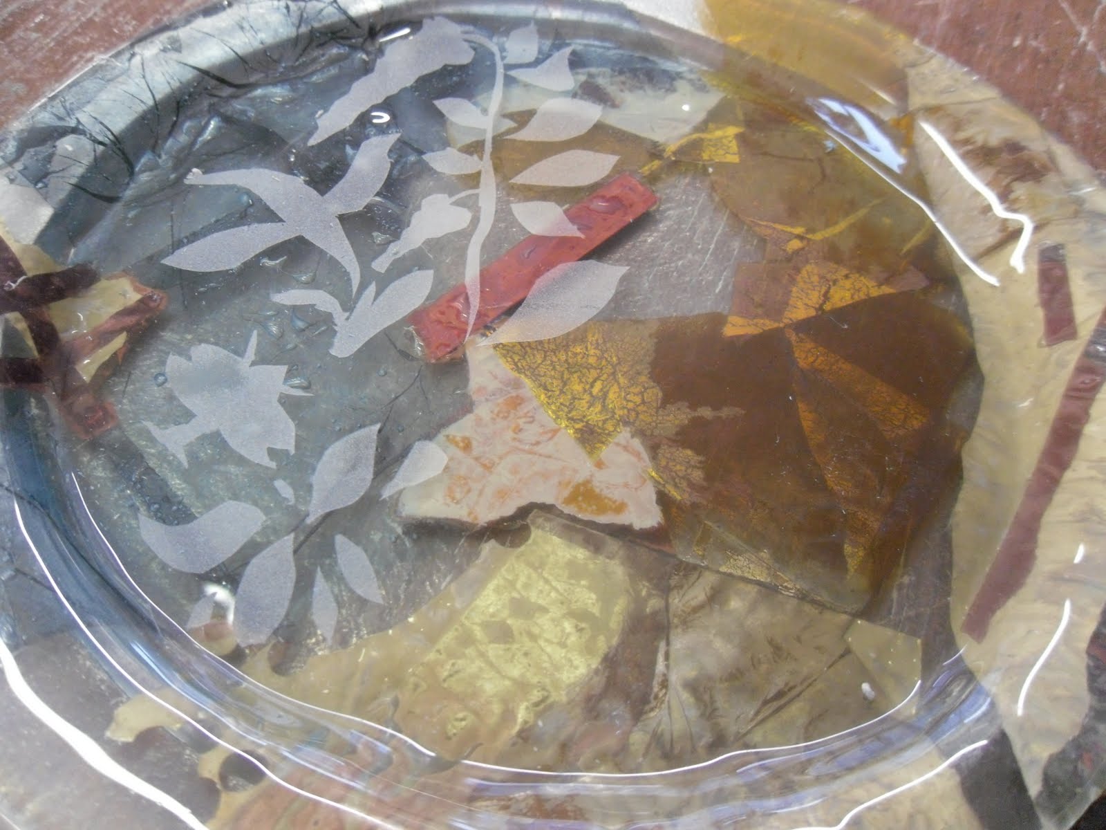
When the plaster moulds were dry enough, I then filled the moulds with a smashed glass and coloured frits (deer brown, aqua and cobalt blue).

In parts I also added some copper and brass wire, following the lines I had drawn into the plaster, and trying to keep the original images in tact .
To add some rigidity I also placed some larger pieces of glass on the top and fired them like this.

The Result!

I was totally unsure of how the pieces would actually turn out and whether the would actually hold together after the firing... but they did! I am really pleased with the result of these pieces, love the colours and the way they catch the light. This one is my personal favourite...

and here are a few close ups...


I also turned the pieces around and surprisingly they work this way too. The colours are much more subtle and I think they give a really nice effect.

Also, I love how the original image is not immediately evident.. the distinguishable facial features have been distorted so much during the process that they are no longer present.


Friday, 23 April 2010

Life Drawing with Clay!


One of our life drawing sesssions was to build up a drawing from a slab of clay. This seemed a daunting task to begin with, but in actual fact it was a very relaxing and almost therapeutic activity.


From this I cast a plaster mould and removed the clay once it had set.

I then cut glass to the size of the mould and placed it in the kiln so the glass took on the shape of the mould, so basically having a glass version of the clay relief. I was pleasantly surprised with the result of this, because some of the clay had fused to the glass and given it more depth and distinction, which I was worried it would lack.


Life Drawing


Finnish Glass Workshop


We had a workshop with a Finnish glass lecturer in February, and she taught us some brand new techniques to consider for our new brief 'Portrait and Identity'.

The method involved painting onto fire blanket with specialist glass enamel and placing a pane on top of the fire blanket which would fuse to the glass once in was fired. Above was my first attempt with just a single layer, and it eas supposed to be a fleshy colour but instead it decded to turn a horrible brown!

We then tried a two-layer and a three-layer piece, which was more difficult than I initially thought because you have to remember what you did on each layer and try to match it up with the others. I really like this two-layer piece, and I decided to engrave into it after it had been fired just to give it some further detail and depth.


This was my three-layer piece which I am not too keen on, because it didn't come out how I expected it to. Still, I loved the workshop and it definitely taught me a different technique I would never have tried otherwise.


The Final Table!


The Final Plates!


Here are the final plates I made for our table. When I made them I hadn't intended them to be the final product but I loved them so much they had to be used! Again I have used silver leaf, copper leaf and copper tape, but I also used a Ferrero Rocher wrapper! I really like the layered effect and the colours that have been produced.


The one below is definitely one of my favourites, just love the textures and the balance between busy areas and more subtle, simple parts. This one also has brass sheet in it, which I hadn't used before and wasn't sure how it would turn out but in fact I think this is the best feature of the plate! (The very top section is covered by brass sheet).


As much as I loved the results of all the plates, I felt as though some were slightly more successful than others and I think this is because some were too plain. So on two of the plates I took aspects of the Chinese patterns I had been looking at throughout the brief and sandblasted them on the areas that I thought needed a further dimension, and I think this has worked really well...


This one again is one of my favourites, I just think it is well balanced and the pattern on the surface almost seems part of the intended design. Also I love my little Chinese symbol in the top left (meaning year of the Ox!).