Friday 15 June 2012

Smashed Coasters

I wanted to start experimenting with making more functional pieces of tableware whilst still using the theme of urban decay, as I thought this would be a really interesting contrast. To begin with, I made some coasters, and the pictures below show the process:


After firing:


The colours from the screen-printing faded drastically after the second fuse-firing, which was really disappointing and meant they did not turn out how I had hoped they would.


Friday 8 June 2012

Peeling Paint Experiments

Decided to continue experimenting with trying to capture the textures of peeling paint and plaster over walls and decaying surfaces.

Here are a few images of the process of slumping over cat litter to get the 'bubbling' texture.

Some of the pieces were sandblasted before the slumping, and some were to be sandblasted after being slumped.


Trying out layout/layering compositions on top of the original laminated tests I had done:


Some of these are a lot more successful than others, and I am glad I took the extra time to experiment a little bit further.


Change of Plan!

So as I was making good progress with my wall design, it was advised to me to continue pushing and experimenting, as there was still another 8 weeks or so left on this brief, and it would be a shame just to stop  at a certain point in order to make an installation piece consisting of ultimately the same thing repeated.

Therefore, the wall design was put on hold while I continued to experiment.

The next stage I felt I needed to look into was to make the bricks individual free-standing sculptures somehow, rather than flat panels. In order to do this however, I needed more layers to add a more stable base.

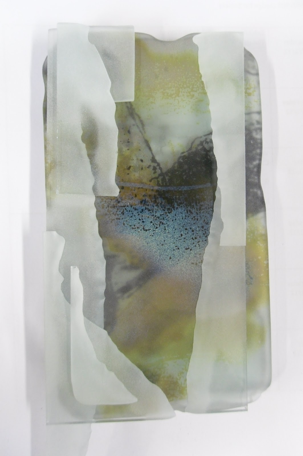
Below is my first try at taking one of the bricks and adding to it to make a more sculptural piece. The initial brick had actually been cut down:


Close Up:


I had wanted the top layers to look like a representation of peeling paint or plaster from a derelict wall, and I had started this experimentation by sandblasting deeply all the way through a piece of glass to get the rough 'eroded' looking edge, and then the pieces were put into the kiln and slumped over cat litter (!) to get the 'bubbling' texture.

I do like the effect it is having, but I think there is room for further development here. A good first try though I feel :)
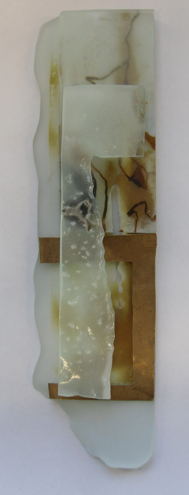
Try #2:


I am so much happier with this piece. Again, I have recycled one of my single-layer bricks to produce this, and I feel like it works really well in terms of composition. I am naturally drawn to long vertical panel shapes anyway, as well as a sepia colour scheme which will always catch my eye!


Close Ups:


Again, I have used another piece which had been slumped over cat litter and I particularly like the deeply sandblasted areas as well as the lightly sandblasted areas where the sketchiness of the screen-print is still visible.

Still needs to be more three-dimensional in order for it to be free-standing, but at least they are becoming more sculptural now.


Other attempts:


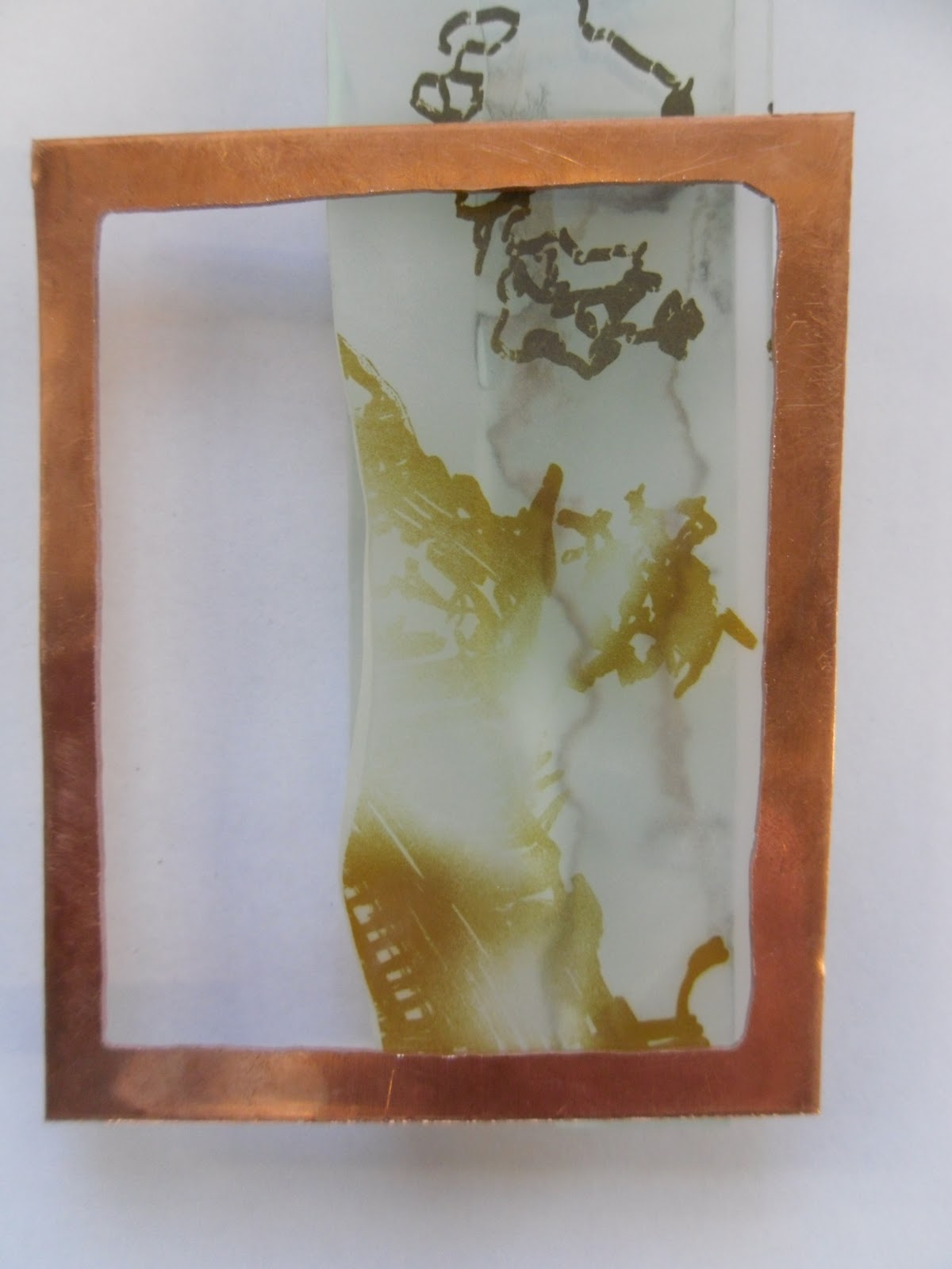
I came across a couple of jewellers that worked to similar themes as me, in particular Kirsty Sumerling, and it made me think about trying to create areas of negative space within the pieces, to add areas of contrast. 
The only was I could think to do this initially was to introduce metal 'frame'-type elements, and I cut some shapes out of copper, brass and gilding metal in order to try it.

I did not want a conventional frame shape, and instead opted for a variety of differing sides.

Here I am trying to figure out composition and whether the metal adds to the piece at all:


I am glad I have tried this, and I do feel it works nicely in certain parts of certain pieces, but it is not something I am going to pursue, and I am going to continue experimenting further.


Wall Piece Designs

I had really enjoyed doing the test pieces and experimenting with different layering techniques, and I wanted to produce a piece that really said urban decay using the things I had been experimenting with.

I decided to create an installation-type piece, and I thought it would be a really nice idea to make a 'section' of a derelict wall which had been placed in a completely contrasting environment, such as a clean white-walled gallery. I had a play around with brick designs and scale, and came up with the design below. My initial designs had been much larger and probably way too ambitious, but I thought a design such as this could be easily added to at a later date if time permitted.


The bricks are all the same size but varying in the amount of layers to them, meaning they would be at different levels from the wall and therefore creating more depth.


I used the drawings I had done to screen print onto the bricks so that the lines overlapped at certain areas, and I planned to use the different panels at differing levels within the bricks (just to make things a bit more complicated and confusing!).


Used a mix of black and silver-stain (turns an amber/brown colour after firing) for screen printing, and was really happy with the results:


Trying out the layout for the design:

(At this point there was not much overlapping with the lines, but I was getting the basic layout organised so then the other layers could fill in the gaps with the lines).


Details of some of the individual bricks:

Some of these are singular layers at this stage, and some of them have a smashed glass layer added to them. These are all yet to be sandblasted at this point too!


I had a play around with having 2 or more bricks where the smashed pattern actually continued over all of them, as I thought this would be much more effective and make the piece seem more like a whole rather than individual pieces put together. Really liking the effects these were having:


After sandblasting (the best bit!):


Because I had UV-bonded the layers together (basically glue for glass which is cured under UV light), some of the sand from the sandblaster had actually become embedded into the inside of the piece, which in theory would be an awful and disastrous thing to happen, but actually I really loved it! I thought it added another textural quality to the bricks and really added to the decaying theme, so I was definitely not bothered by this at all!


Monday 7 May 2012

Further Experimentation


I love to screen-print :) as you may have worked out, and I thought I would screen-print some of my drawings I had done of decaying things, like eroded bark, rusted metal bolts and peeling paint.


One of these images was screen printed in silver stain, and so turned a lovely browny-amber colour during the firing. As I wanted to continue experimenting with laminating glass, I decided to try laminating with UV bonding instead of resin, and instead of trying it with a boring bit of plain clear glass, I wanted to use screen-printed pieces. Here I have started layering the silver stain piece and the black pieces:


Really like the two colours together, and the depth that is created through the layering. The next step I wanted to try was to laminate smashed glass with UV bonding rather than resin. The piece below shows my first attempt at this, and immediately after I had done this I absolutely hated it! 


I hold the opinion that glass always looks better after it has been sandblasted- it is something I have always thought ever since first year. So I decided to sandblast it and wayhey- an improvement! Still was not overly fussed but it seemed to attract a lot of attention from passers by when it was sitting on my desk so that says something!


After achieving a sense of some progress, I went back to my initial screen-printed pieces and added a third layer in between the other two, and this was a smashed layer. It varied throughout the test pieces whether the smashed layer consisted of  black screen-printed glass, silver stain screen-printed glass or clear float glass.

In some cases too I also tried adding pieces of bark to the smashed layer- aiming to trap the bark on the inside with the smashed pieces:


Sticking to my guns, I headed to the sandblaster and focused mainly on sandblasting the edges and corners of the pieces relatively deeply to create an 'eroded' effect. I didn't want to sandblast any of the front or back really, as the detail of the inside layers would not then be visible.

The pieces after sandblasting:


Really really happy with the results of these test pieces- I really feel as though they are capturing the textures that I was aiming to capture all along :)